Keeping up with social media is critical for a successful business. Checkout the latest Twitter update.
Twitter’s getting ready to smooth out some of the little blue bird’s feathers.
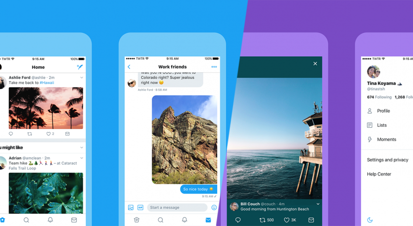
Over the course of the “coming days and weeks,” the company said, it will begin rolling out a series of updates that will change not only the settings on people’s profiles, but also the way they engage with the platform as a whole. In a blog post published today, Grace Kim, Twitter’s vp of user research and design, described the changes, including updates to links, typography, icons and of course tweets themselves.
“Last year, we told you exactly who we are (Twitter is what’s happening!) and refreshed our brand,” Kim wrote. “Today, with lots of feedback and ideas from you, we’re refreshing our product too and making it feel lighter, faster and easier to use. We listened closely and kept what you love. And for the things you didn’t, we took a new approach to fix and make better.”
For iPhone users, Twitter is debuting a new side navigation menu that includes fewer tabs than before—similar to an Android update from last year. The way links open will also change—Safari’s browser will open within Twitter’s app so users can easily access other websites they’re already logged in to.
Both Android and Apple users will also notice a “refined” typography, which is meant to make wordings more consistent and headlines bolder. To borrow a Twitter phrase, this update will make it easier to see “what’s happening” nearby and around the world based on the day’s events and what people are tweeting about. The photos people use on their profiles will also be rounded a bit, which according to Twitter, will make it easier to keep track of who’s saying what and what’s being said.
While it currently requires refreshing a screen to see the most up-to-date counts for replies, retweets and likes, the updated app will update tweets instantly. Twitter said this will help keep up with conversations in real time.
Icons will also be redesigned to make it easier to engage with tweets in a way the company hopes will make posting more “intuitive.” This could be especially useful for newer users—anyone who has been following the company for the past year or two knows how much it’s focusing on growing its user base and building engagement among existing users.
“For example, people thought the reply icon, an arrow, meant delete or go back to a previous page,” Kim wrote. “We switched to a speech bubble, a symbol most know and love. We also made the icons lighter for more seamless interaction.”
In addition to the updates for the average user, Twitter is also making the site more accessible with added color contrast, as well as a way to always open directly to Safari Reader, a stripped-down text-based version of the browser.

Sorry, the comment form is closed at this time.